Responsive Web Design
What is responsive web design?
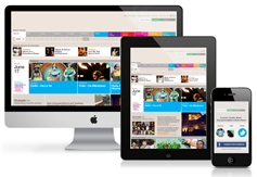
The primary idea of Responsive Web Design (RWD) is to have a flexible fluid layout that adjusts itself and responds perfectly to differing screen sizes of various web browsers and mobile devices. The final results are well built layouts with scaled images and dynamic re-flows of web content.
What is the need for a responsive design?
Responsive web design is considered to be one of the greatest innovations as far as web designing is concerned. Single coding and content set is more than enough, for the website to work as magic on a variety of screen sizes and web browsers. Gone are the days of static design layouts as it is no more capable of managing the increasing e-users. A responsive for such an adaptable web landscape is essential, in order to lodge the multiplying online users.
The Responsive web design is on fire as it is becoming popular among the crowd. A lot of web designers are getting busy in redesigning their layouts to render a better user experience. This in-turn would hike the conversion rates, thereby contributing to a raise in sales.
The formal stance of Google on mobile optimised websites
From HYPERLINK "https://developers.google.com/webmasters/smartphone-sites/details"
Google shoulders smart phone optimized sites in three configurations:
1. Websites with responsive web design, use the same URL for all the internet connected devices. CSS is used to change how the webpage is rendered on each device but the code in HTML remains static. This is Google's recommended configuration.
2. Same set of URLs are used to serve all the sites dynamically. But the code in HTML and CSS differ depending on the device of the user agent, i.e. whether it is a desktop or mobile device.
3. Sites that have separate mobile and desktop URLs.
Responsive vs Adaptive
Adaptive websites identify its user browsing via a mobile device and automatically redirects the user to the responsive mobile site
e.g. http://m.yoursite.com
Few reasons why adaptive mobile website's a bad choice:
1. SEO – You land up having a duplicate content penalty if SEO is done.
2. Extra maintenance - it is equal to having 2 sites to manage
3. No support for tablets – users on tablets, need to still pinch and zoom.
4. Built for single screen size only e.g. iPhone's 3.5" screen - most Androids are 4" or bigger.
Responsive Design a better choice:
1. SEO – all the content is on a single site. The website adjusts itself by resizing and rearranging depending on the screen size. There is no duplicate content penalties.
2. No extra maintenance is needed as the site is built only for single device.
3. Each device has a different view, usually landscape or portrait.
4. Responsive web design supports any size of screen ranging from 3.5'' to the latest 84' HDTV sets that have web browsers
Is it possible for an existing site to be updated to a responsive design?
Conventionally it's a big 'No' when it comes to an existing site updated to responsive design. It is much easier to start from the scratch as the coding for responsive website uses percentage based widths to be fluid.
Updation of latest web standards like HTML5 and CSS3 are highly recommended to keep Google happy.
Worth your Penny!
A lot of effort is required to design a responsive website. User Experience (UX) is considered important for 3 reference screen sizes, generally, 3.5"(iPhone), 10"(iPad) and 15"(Laptop). Viewing distance, broadband speeds, business type and the like are certain core factors to be taken under consideration in the design phase of building a site. This will obviously bloat up the visitors' conversion rate to the website.
The next phase is to test the design on phones, tablets and PC's which is triple the amount of work of designing for PC's alone. The cost of a responsive website with an attractive and unique design would be roughly $4000.