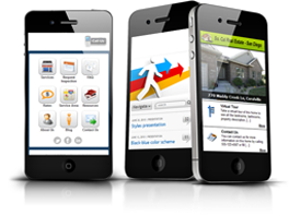
Mobile website design
If you're yet to consider a mobile optimised
responsive website, here's why you should –
1. The estimated count of Internet users via mobile alone will be 788 million by 2015.
2. The world mobile data has grown by a factor of 2.6 in 2010 from 2009.
3. Minimal smart phone usage hiked up from 35MB per month in 2009 to 79MB per month.
4. The data usage in Android is contagiously catching up with the iPhone.
Why the change?
Owing to the overwhelming popularity of smart phones among mobile phone subscribers, lead to the growth of exceeding expectations in data rate usage.
Previous year, Cisco predicted that the smart phone installed base would rise 22% in 2010 but, recent data indicates that the number of smart phones in use soar by 32% during that year. Foot note: smart phones in use in 2009 was 399 million whereas in the following year it was 526 million (increased by over half a billion smart phones in the hands of consumers in the next year).
The Platform that we develop our mobile website for – iPhone, Android or Windows?
Android usage dramatically caught up as the forerunner in 2010. In the initial stages of 2010, iPhone data consumption exceeded Android's by a factor of four. Towards the end of the year, iPhone outpaced devices with Android operating system by 1.75. A 3rd type of platform is added by Windows Mobile to be considered.
Nexploc can construct a responsive design for your website to discover the screen size and work the magic to fit, providing your brand site a uniform experience on a wide range of devices, which in return renders a great experience for the end user!
Once you activate a responsive design on your website, you will want to experiment our boosted reality marketing solutions for ways to exhibit your online presence in the offline world.


